Best practices for visualizing data
- Nguyen Huynh
- February 24, 2023
- Blog articles
- 0 Comments
At its most basic level, data visualization is the process of displaying data in a way that is easy to understand and interpret. It involves the use of visual elements such as charts, graphs, maps, and other graphics to help people gain insights from data.
The goal of data visualization is to present data in a way that is not only aesthetically pleasing but also easily understandable. This helps people to see patterns and trends that might not be obvious in raw data. With the right visual representation, data can be used to answer a question, solve a problem, or tell a compelling story.
For example, data visualization can be used to answer questions such as:
- How has the number of COVID-19 cases changed over time in different regions?
- What are the most common causes of car accidents in a given area?
- How have sales of a particular product changed over time?
In each of these cases, a visual representation of the data can help to make the trends or patterns in the data more apparent and easier to understand.
Similarly, data visualization can be used to solve problems, such as:
- Identifying which parts of a manufacturing process are slowing down production
- Pinpointing the areas of a website that are causing the most user frustration
- Determining which factors are most closely correlated with customer churn
In these cases, data visualization can help to make the underlying patterns or relationships in the data more clear, which in turn can lead to actionable insights that help to address the problem at hand.
Finally, data visualization can be used to tell compelling stories with data, such as:
- Visualizing the effects of climate change on global temperature trends over time
- Demonstrating the impact of social and economic factors on health outcomes in different regions
- Depicting the evolution of a particular industry or market over time
In these cases, data visualization can help to make complex ideas or concepts more accessible and understandable to a wide audience, and can help to communicate a message in a clear and engaging way.
Here are some steps to help you get started with data visualization:
- Identify your goals: Before you start working with data, it’s important to understand what you want to achieve. Do you want to communicate a particular message, explore data for insights, or create a dashboard for monitoring performance? Once you have a clear goal, you can focus on the data that matters most.
- Gather your data: Data visualization requires data, so you need to gather relevant data from your sources. This can include data from spreadsheets, databases, APIs, or other sources. Make sure the data is reliable and clean, and if necessary, clean and transform the data to get it into the right format.
- Choose the right tools: There are many data visualization tools available, from simple charting tools to more advanced software like Tableau or Power BI. Choose a tool that suits your needs and your level of experience.
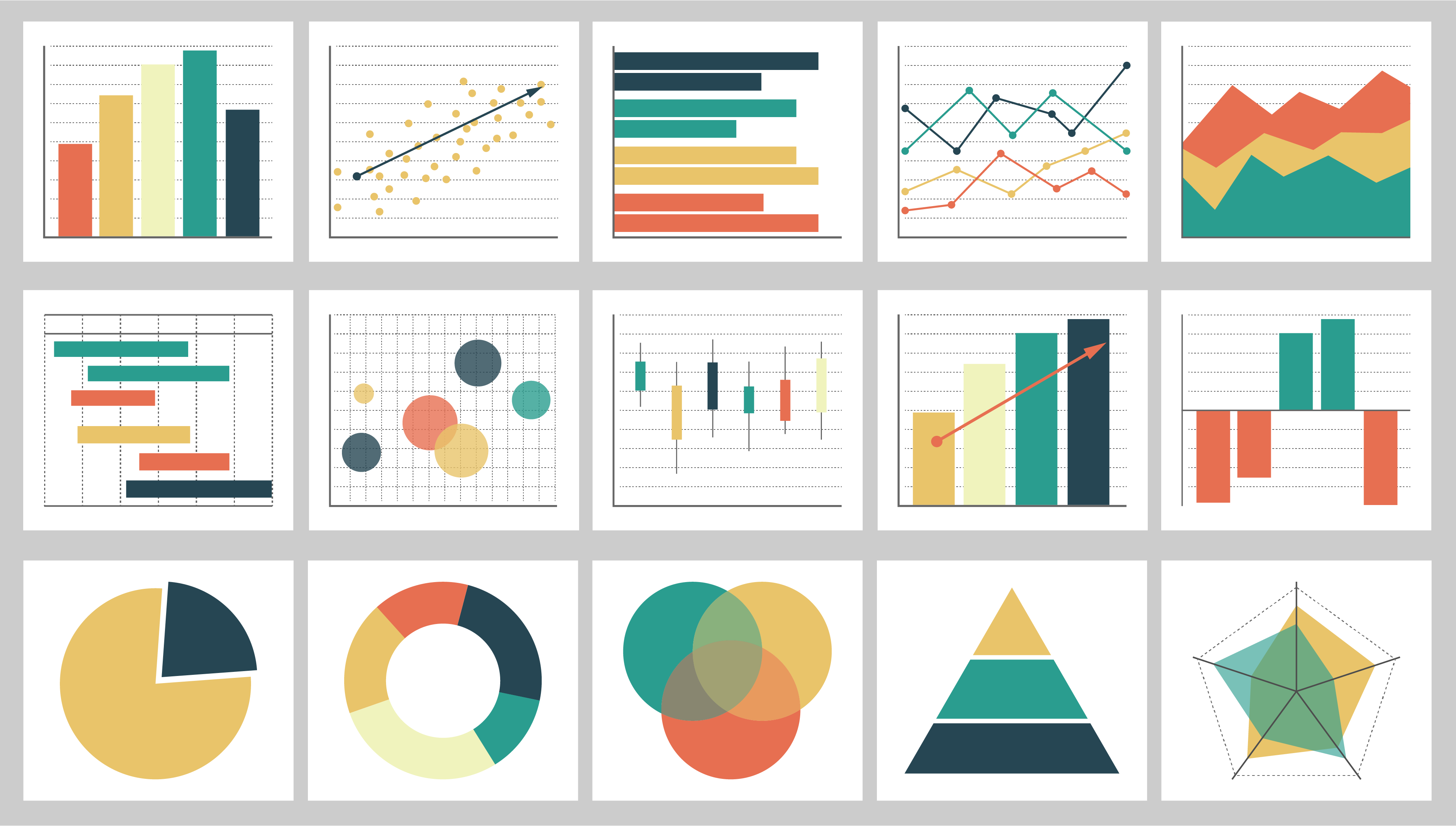
- Determine the best visualization type: There are many different visualization types to choose from, including bar charts, line charts, scatterplots, and heatmaps. Consider what type of data you have and what you want to communicate to determine the best visualization type for your needs.
- Design your visualization: Once you have chosen the right visualization type, start designing your visualization. Consider color schemes, fonts, and labels to create a clear and compelling visualization. Remember to keep your audience in mind and choose a design that will communicate effectively to them.
- Iterate and refine: Data visualization is an iterative process, so don’t be afraid to make changes and refine your design until you have a clear and compelling visualization that meets your goals.
Effective data visualization is about more than just pretty pictures. It requires careful consideration of what data is most important, what visual format will be most effective, and how to design an interface that is intuitive and user-friendly. With the right approach, data visualization can be a powerful tool for decision-making, problem-solving, and innovation.
To help you get the most out of your efforts, here are some additional best practices for data visualization:
- Keep it simple: Cluttered visualizations can be overwhelming and difficult to understand. Keep the visualization simple and avoid adding unnecessary elements.
- Use color effectively: Color can be a powerful tool for data visualization, but it’s important to use it appropriately. Use color to highlight important data points or groupings, but avoid using too many colors or colors that are too bright or distracting.
- Label clearly: Ensure that all elements of the visualization are clearly labeled, including axis labels, titles, and legends.
- Maintain consistency: Consistency is key to creating a clear and effective visualization. Use consistent colors, fonts, and design elements throughout the visualization.
- Use appropriate scales: Choosing appropriate scales for axes and legends is critical to creating an accurate and understandable visualization.
- Provide context: Providing context helps users understand the data and its relevance. This could include providing reference points, historical data, or other relevant information.
- Test and iterate: We just can’t stress it enough: data visualization is an ongoing, iterative process and requires continuous improvement. Before finalizing a visualization, test it with a diverse group of users and gather feedback. Use this feedback to make improvements and iterate on the design until it effectively communicates the intended message.
Remember, data visualization is both an art and a science. It takes practice, experimentation, and an understanding of best practices to create clear, effective, and engaging visualizations.
Related Posts


Leave A Comment
You must be logged in to post a comment.