Data Visualization: The Art of Turning Numbers into a Masterpiece
- Nguyen Huynh
- February 24, 2023
- Blog articles
- 0 Comments
Have you ever tried to make sense of a spreadsheet full of numbers? It’s enough to make anyone’s eyes glaze over. But what if I told you that you could turn those boring numbers into a beautiful work of art? That’s right, it’s time to introduce you to the world of Data Visualization.
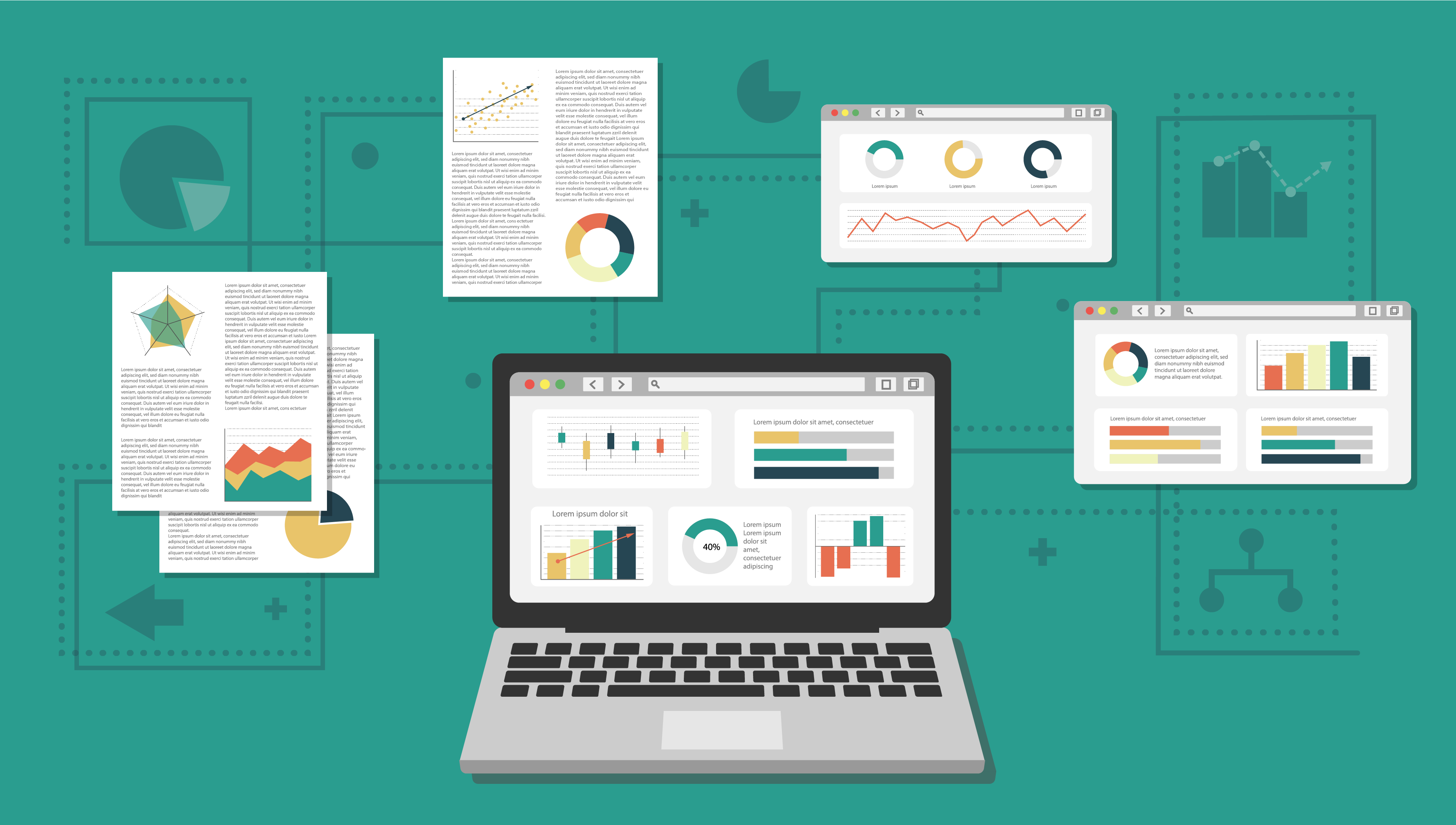
Data Visualization is the process of transforming raw data into visually appealing and easily digestible graphics. Think of it as the bridge between complex data and your brain. By using graphs, charts, maps, and other visual aids, data visualization can help you see patterns, trends, and insights that would otherwise go unnoticed.
So, why should you care about Data Visualization? Well, for starters, our brains are wired to process visual information much faster than text. By using Data Visualization, you can save time and effort by quickly understanding your data at a glance. Plus, it’s a lot more fun to look at a colorful graph than a sea of numbers.
There are endless possibilities when it comes to Data Visualization. You can create bar charts to compare data, line graphs to track trends over time, and pie charts to see how different data sets relate to each other. And if you want to get really creative, you can even create interactive dashboards and animations.
Data Visualization isn’t just for big corporations and tech companies, either. With the rise of tools like Tableau, PowerBI, and Looker Studio, creating stunning visualizations has never been easier. So whether you’re a small business owner or a marketer, Data Visualization is a tool that you should definitely have in your arsenal.
Here are some data visualization applications that succeed in Digital Marketing, Retail, and Financial:
Digital Marketing: By visualizing data, marketers can make more informed decisions about their campaigns. For example, they might use visualizations to identify which marketing channels are driving the most traffic and conversions, or which products or services are most popular among their target audience. This information can help them allocate resources more effectively and optimize their campaigns for better results.
Retail Sales Visualization: Retailers often use data visualization to track sales trends and identify areas for improvement. For example, Walmart created a tool called My Walmart Schedule that allows employees to view their work schedules and receive alerts about schedule changes. The tool includes a dashboard that displays real-time sales data, which helps employees understand how their work is contributing to the success of the store.
Financial Data Visualization: Financial institutions use data visualization to analyze and report on financial data. For example, American Express developed a tool called Spend Analyzer that allows business owners to track their expenses and identify areas where they can cut costs. The tool includes a dashboard that displays spending trends, top vendors, and other key metrics in an easy-to-understand format.
When embarking on your first data visualization project, it is important to consider the following points:
- Define your goals: Clearly define what you hope to achieve through data visualization and what insights you want to uncover.
- Choose the right tool: There are many data visualization tools available in the market, so choose one that fits your needs and skill level.
- Clean and prepare your data: Ensure that your data is accurate and in a usable format before creating your visualization.
- Choose the right type of visualization: Depending on the type of data you have and the insights you want to uncover, choose a suitable visualization such as a bar chart, line chart, scatter plot, or map.
- Consider the audience: Keep in mind who your audience is and what information they want to see. Ensure that the visualization is visually appealing, easy to understand, and presents the information in a clear and concise manner.
- Test and iterate: Test your visualization and make changes if needed. It is important to get feedback and make sure that the visualization effectively communicates the insights you want to convey.
- Continuously improve: Regularly review your data and visualizations, and make changes as needed to ensure that they continue to be useful and relevant.
Data Visualization is a powerful tool that can help you make sense of complex data, save time, and bring your data to life. So go ahead and turn those boring numbers into a masterpiece. Your brain will thank you!
Related Posts


Leave A Comment
You must be logged in to post a comment.